Are you struggling to create a peaceful sanctuary in your bedroom? The colors you choose can significantly impact your mood and sleep quality. Studies show that certain hues can promote relaxation and tranquility, making it essential to select the right palette for your space. In this article, we will explore the best colors for a relaxing bedroom, drawing from color psychology and design principles to help you transform your environment into a soothing retreat. You’ll learn how different shades affect your emotions, discover popular color combinations, and find practical tips for incorporating these hues into your bedroom design.
Understanding Color Psychology in Bedrooms
Color psychology plays a crucial role in creating a relaxing bedroom atmosphere. Different colors evoke specific feelings and moods, influencing our state of mind. For instance, cool colors like blue and green are often associated with calmness and peace, making them ideal for a tranquil space. On the other hand, warm colors like red or orange can be stimulating, which may not promote relaxation. By understanding how colors affect emotions, you can make informed choices to create a serene environment that fosters rest and rejuvenation.
Cool Colors for Serenity
Cool colors, such as blue, green, and lavender, are known for their calming effects. Blue is particularly effective in reducing stress and promoting a sense of tranquility. Green brings the essence of nature indoors, encouraging relaxation. Lavender, with its soft hue, creates a peaceful ambiance, perfect for winding down at the end of the day.
Warm Colors and Their Impact
While warm colors can create a cozy atmosphere, they may not be the best choice for a relaxing bedroom. Shades like red and orange stimulate energy and excitement, which could interfere with sleep. If you prefer warm tones, consider using them as accent colors rather than the main palette to maintain a soothing environment.
Key Points:
- Color choice influences relaxation
- Cool colors promote calmness
Choosing the Right Shades for Your Bedroom
Selecting the right shades for your bedroom involves more than just personal preference; it requires consideration of the room’s size, lighting, and overall decor. Light colors tend to make a space feel larger and airier, which can enhance the feeling of relaxation. Conversely, darker shades can create a cozy, intimate feel but may also make a room feel smaller. By balancing these factors, you can create a harmonious space that encourages rest and relaxation.
Light vs. Dark Colors
Light colors, such as pastels and whites, reflect more light, making a room feel more open and inviting. This can contribute to a sense of tranquility, especially in smaller spaces. Darker shades, while potentially cozy, can close in a room and might require additional lighting options to maintain a relaxing atmosphere.
Considering Natural Light
The amount of natural light your bedroom receives can significantly influence how colors appear. Rooms with abundant light can handle darker shades, while those with limited natural light may benefit from lighter colors to avoid a gloomy atmosphere. Always test paint samples in different lights to see how they affect the room’s mood throughout the day.
Key Points:
- Light colors can enhance space perception
- Natural light affects color appearance
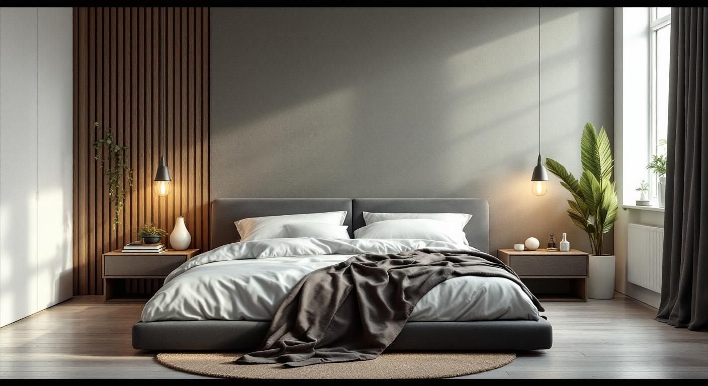
Understanding Color Psychology in the Bedroom
Color psychology plays a crucial role in setting the mood of a space, particularly in a bedroom where relaxation is key. Colors can evoke emotions and influence how we feel. For a calming environment, consider colors that have soothing associations. Blues and greens are often regarded as the best colors for a relaxing bedroom because they mimic nature, promoting tranquility and peace. Soft neutrals like beige and gray can also create a serene atmosphere while providing a versatile backdrop for decor.
The Impact of Blue and Green
Blue is often associated with calmness and stability, making it a popular choice for bedrooms. It can lower heart rates and reduce anxiety. Similarly, green, reminiscent of nature, fosters a sense of renewal and balance. Incorporating these colors in soft shades or through accent walls can enhance the relaxing qualities of your bedroom.
Neutral Tones for Versatility
Neutral colors such as soft whites, beiges, and light grays can create an inviting and peaceful bedroom environment. These shades allow for versatility in decor and can be paired with various accent colors. They also reflect light well, making a space feel airy and spacious, thereby contributing to a calming atmosphere.
Key Points:
- Color psychology significantly impacts mood
- Soft shades promote tranquility and relaxation
💡 Choose colors based on personal preference to enhance comfort
💡 Test paint samples in different lighting before making a decision
Creating a Cohesive Color Palette
A cohesive color palette is essential for a relaxing bedroom. Selecting a few complementary shades can help unify the space, making it feel intentional and serene. Start by choosing a base color that reflects the mood you want to create, and then add accent colors that enhance this feeling. Consider using various shades of the same color for depth and interest without overwhelming the senses.
Accent Colors for Depth
While your base color sets the mood, accent colors can add depth and dimension to your bedroom. Consider using darker or lighter shades of your base color for furniture, textiles, or art. This will maintain a calming effect while providing visual interest and character to the space.
Incorporating Textures and Patterns
Texture and patterns can enhance the overall color scheme while promoting relaxation. Use soft fabrics for bedding, curtains, and rugs that complement your color choice. Patterns in subtle tones can add complexity without being overwhelming, contributing to a cozy and inviting atmosphere.
Key Points:
- A cohesive palette promotes a serene environment
- Textures can enhance the feeling of comfort and relaxation
💡 Limit your color palette to three main colors for cohesion
💡 Use natural materials to enhance the calming effect of colors
EXPERT TIPS Pro Advice
Consider natural light in color selection
Natural light changes how colors appear. Test colors during different times of the day to ensure they evoke the desired mood.
Use the 60-30-10 rule for color distribution
Distribute colors in a room using 60% for the dominant color, 30% for the secondary, and 10% for accents to create balance.
Incorporate plants for a touch of green
Adding plants can enhance the calming effects of green tones while improving air quality, promoting overall relaxation.
Choose cool tones for a smaller space
Cool colors can make a small bedroom feel larger and more expansive, contributing to a relaxing atmosphere.
Avoid overly bright colors
Bright colors can be stimulating and may hinder relaxation. Opt for muted tones to create a soothing environment.
Frequently Asked Questions
Conclusion
Creating a relaxing bedroom involves choosing colors that promote calmness, such as blues and greens. Balance these with neutrals and consider lighting to enhance the atmosphere. Patterns can be incorporated if they remain subtle. Overall, aim for a serene and harmonious space.
🎯 Key Takeaways:
- Soft colors like blue and green promote relaxation.
- Consider the impact of colors on sleep quality.
- Balance dark colors with lighter accents for coziness.
- Lighting plays a crucial role in color perception.
- Subtle patterns can enhance tranquility without overwhelming.
Expert Advice: Select colors that resonate with your personal sense of peace and comfort, creating a sanctuary that invites relaxation and restful sleep.
Take some time to explore color swatches and envision how they could transform your bedroom into a peaceful retreat.